To design a metal band logo that survives real life, you need seven things in order: a clear visual direction, a logo structure that holds at thumbnail size, lettering you can actually read, several sketch directions, a refinement pass, a small-size test, and clean export files. Most first attempts fall apart at two points only — symmetry and legibility — so both get their own attention below. The whole process takes an evening for a do-it-yourself band with a vector tool, or a few weeks of waiting if you commission it.
The honest bit about this craft: there is no single metal logo style. A black metal mark, a death metal mark and a metalcore mark signal three different things to the people who will wear your shirt, and copying one of them costs you the only thing you own — a look nobody else has.
Table of Contents
- What You Need
- How to Design a Metal Band Logo
- Step 1: Define the Band’s Visual Direction
- Step 2: Choose a Legible Logo Structure
- Step 3: Select Typeface and Lettering Styles
- Step 4: Sketch Multiple Logo Directions
- Step 5: Refine the Symbol and Letterforms
- Step 6: Test the Logo at Real-World Sizes
- Step 7: Prepare Files and Protect the Final Design
- Common Mistakes
- Frequently Asked Questions
- Why are death metal logos unreadable?
- Can ChatGPT design a metal band logo?
- What font should I use for a metal band logo?
- How can I create a band logo for free?
- Should a metal band logo be readable at all?
- How do I make a symmetrical metal logo?
- Conclusion
What You Need
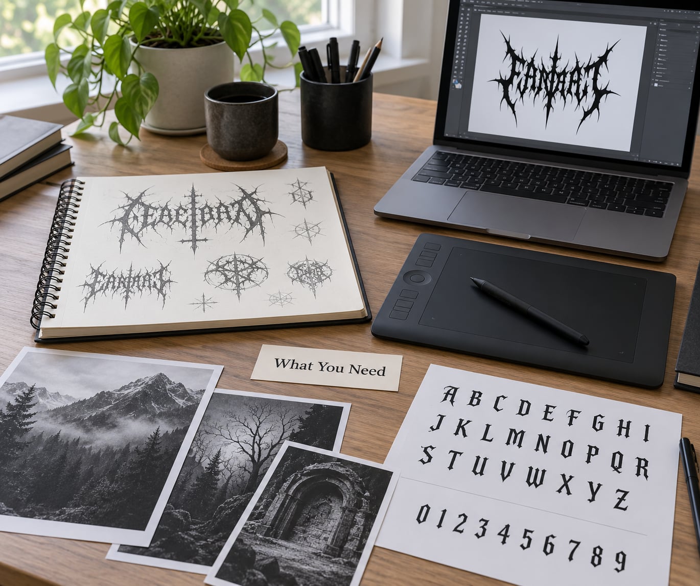
Before you open any software, gather four things. Without them you will make decisions by vibes and end up with a mark that does not fit your music.
A written direction in one paragraph. Three words for the sound, three for the look, one sentence on who buys your records. Something like “slow, ugly, cathedral-heavy; black and bone white; people who like Gorgoroth and Sewer.” Write it on paper. Every later decision gets measured against it, and it stops you from drifting into a generic skull.
Reference images. Collect fifteen marks you like and five you dislike, from your own scene rather than from generic design blogs. Note why. “I like how the terminals on this one stop short of the cap height” is useful; “this looks cool” is not.
A vector drawing tool. Inkscape is free and does everything described here, including mirroring and outlining text. Affinity Designer and Illustrator are the paid alternatives. Raster-only editors are workable for sketching but painful for the production stage.
A place to test. A folder where you can drop a 40-pixel-wide version of the logo next to a 2000-pixel-wide one and see both at once. That comparison is the whole point of the testing step, and it comes free in most vector programs as a zoomed-out workspace view.
How to Design a Metal Band Logo
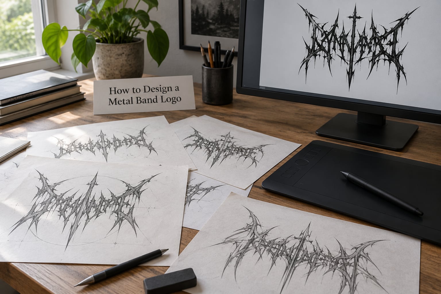
Learning how to design a metal band logo is mostly a sequence of narrowing decisions. You start wide with several rough directions, cut to one, then push detail in until the mark reads the way you want at every size it will ever appear.
Step 1: Define the Band’s Visual Direction
Write your direction paragraph first, then translate it into three concrete choices: subgenre reference, symmetry treatment, and palette. This is where your logo separates itself from the pack.
| Subgenre | Visual shorthand | Symmetry | Palette |
|---|---|---|---|
| Black metal | Illegible, thorny, medieval | Mirrored or freeform asymmetry | Black and white, inverted |
| Death metal | Spiked, grim, high detail | Symmetrical with a central axis | Black, bone, blood red |
| Brutal death / slam | Grindhouse, blunt, grotesque | Heavy block mass, centred | Black with rust or acid accent |
| Thrash | Hand-drawn, aggressive, angular | Loose, forward-leaning | Black and red, sometimes yellow |
| Metalcore | Geometric, clean, modern | Deliberately straight | White or single accent on dark |
| Doom | Thick, slow, monolithic | Weighted, low centre of gravity | Muted, aged |
If you write metalcore and your lettering has 40 spikes, people will read it as death metal, and your merch will land in the wrong crate. Pick one row and stay inside it.
Step 2: Choose a Legible Logo Structure
Choose the structure before you choose the font, because the structure decides how much detail you can afford. There are four common ones: a wordmark (the band name alone), a lettermark or monogram (initials only), an emblem (symbol carrying the name), and a combination mark (symbol plus wordmark).
For metal, a wordmark built around one strong shape beats a busy emblem. Emblems that work at poster size often collapse into a black blob on a patch.
The symmetry treatment is the real decision. Mirror symmetry means drawing one half, duplicating it, flipping it horizontally, and welding the two together down the middle — that is how most symmetrical black metal logos are built, and it is exactly the effect people report being unable to find in template tools. Split symmetry lets each side differ slightly, which reads as organic rather than stamped. Freeform asymmetry abandons the axis entirely and leans on a consistent angle system instead.
In Inkscape or Illustrator: draw the left half, select it, duplicate, choose flip horizontal, line the duplicate up on the centre axis, then set the top object’s blend mode to Difference. The overlap merges into one symmetrical mark, and you can keep tweaking either side because nothing is welded yet.
On legibility, here is the honest answer to a question that comes up constantly: death metal logos are unreadable because unreadability is a deliberate stylistic choice, not an accident. Reduced letterforms, merged counters and hairline terminals all read as aggression at a glance. The catch is that the mark then collapses everywhere it appears small, so the workable version keeps one fully readable line of lettering and puts the illegibility in the ornament around it.
Step 3: Select Typeface and Lettering Styles
Type is where most metal logos live or die. Three routes work, and mixing them usually looks like a mistake.
- Use a blackletter or Old English face as-is. Fastest and cheapest route. Families like Cloister Black, Cloister Blacklet, UnifrakturMaguntia and Pirata One are the common starting points, and each sends a different signal — the heavier and more decorative the face, the more black metal and the less readable.
- Use a brutalist or heavy display sans, then treat it. Condensed, blocky, slab shapes are the metalcore, thrash and doom route. Bevels, sharp corners and stretched proportions do most of the work.
- Draw custom letterforms. The only route that guarantees nobody else has it. Build each letter from a few shapes, then merge and redraw the joins so the stroke weight stays even.
Two practical rules. Check the licence before you print shirts — a font being free to download is not the same as free to put on merchandise, and most metal faces have separate desktop and commercial terms. And keep letter spacing tight and deliberate: metal logos traditionally set their letters close, sometimes touching, and an inconsistent gap reads as amateur faster than any other flaw.
Whatever face you start with, convert the text to outlines or paths early. After that, every letter is an editable shape, and the font’s licence stops mattering to your file.
Step 4: Sketch Multiple Logo Directions
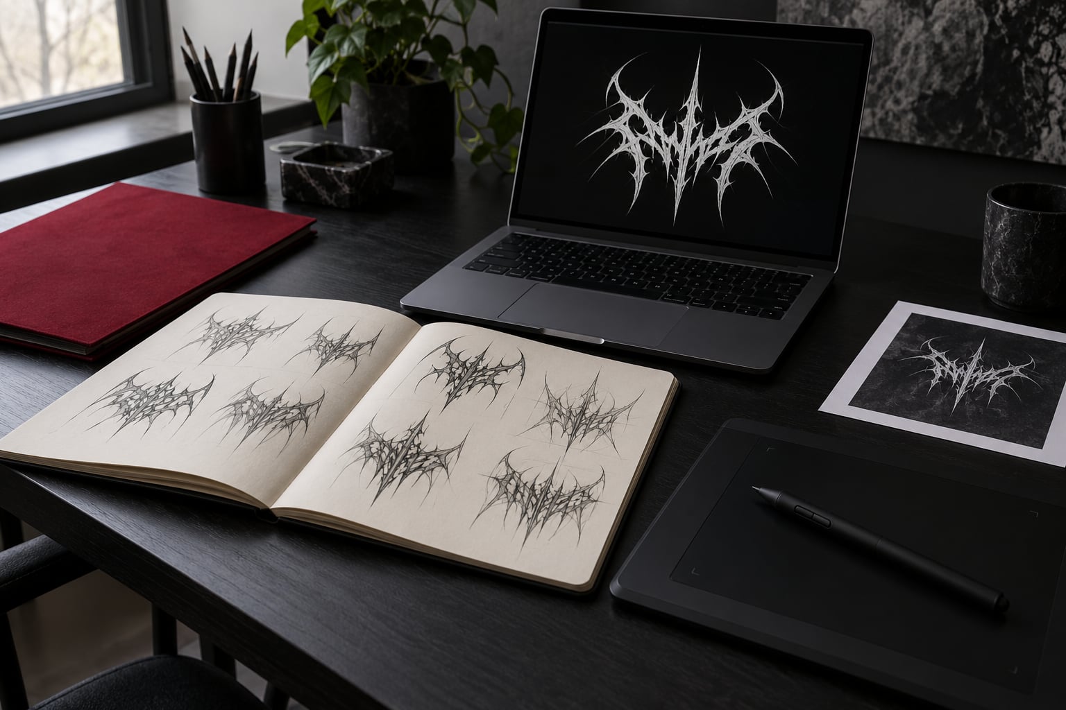
Sketch at least six thumbnail concepts before you open the vector tool, and do them small. Smallness is the filter: if a direction does not work as a rough rectangle, it will not work as a streaming avatar.
Vary the structure across the six, not just the decoration. Two wordmarks, one monogram, one emblem, one combination and one deliberately experimental piece. Then push the band name into a shape — a wedge, a downward slope, a vertical stack, a sprawl that fills the rectangle.
Common sources for the mark itself: a letterform that becomes a spike, a split version of the first letter, thorned borders, chains, or a simple object tied to a lyric or a place. Avoid anything you could describe in three generic words, because so could everyone else.
Step 5: Refine the Symbol and Letterforms
Pick the strongest direction and rebuild it properly at full size. Now you are doing real logo work: balance, optical correction and restraint.
Check the mass on all four sides. A logomark with heavy ornament on the left and a thin tail on the right looks wrong even when the numbers technically match, so nudge the ornament until the weight reads even. Round letters normally need to sit marginally larger than square ones, which is normal optical compensation rather than an error.
Then strip ornament that does not carry meaning. Every spike should point somewhere, every texture should describe something about the music. If a detail disappears entirely at 40 pixels wide, it is a candidate for cutting — unless it exists purely as a reward for people looking closely on a shirt.
Texture passes come last, on a separate layer: grain, weathering, dry-brush edges, subtle symmetry breaks. Keep the texture on a layer above the wordmark and keep it subtle, because distressed edges below a certain contrast simply turn to mud when the print run is small.
Step 6: Test the Logo at Real-World Sizes
Test the mark at every size it will live at, in this order: a streaming profile picture at roughly 40 pixels tall, a small profile avatar, an album-cover thumbnail, a chest print about 25 centimetres wide, a patch, a poster, and a stage banner scaled up to three metres.
Two failure modes show up here. At small sizes, fine detail and thin contrast edges disappear first, so hairline spikes and thin counters vanish and the letterforms merge. At large sizes, a mark with too little detail looks empty and unfinished across a banner.
Test in greyscale and in one colour, not just full colour. Most merch gets printed in limited spot colours, and the red accent that saved the logo on screen can disappear entirely once the printer uses a different ink.
Ask two people who did not see the sketches to name the band from the small version. If they cannot, add the missing clarity before you move on.
Step 7: Prepare Files and Protect the Final Design
Build the final artwork as vector shapes with no raster effects baked in, then export a small package rather than one file.
- Vector for print. Save an EPS and a PDF with the text outlined and any transparency flattened, since many print workflows choke on live transparency.
- Vector for web. Save an SVG. It stays crisp at any banner size and works fine in browsers.
- Raster for streaming and social. Export PNGs with a transparent background at around 2000 to 3000 pixels wide for profile images, plus one square version with a solid background for platforms that crop.
- One-colour version. A single-colour black-on-white file that any printer can work from.
- A one-page usage note. Clear space, minimum sizes, approved colours, and the fonts used if any text stayed live.
On protecting it: avoid filing trademark claims you will not fund. A US trademark application for a band logo is a real cost and takes real time, and most self-released bands never reach the volume where it matters. What actually protects you is keeping your original source files and dated sketch progress, registering your domain and social handles, and staying clear of iconography lifted from other bands.
That last point is worth more than any filing. A logo built from another band’s symbol invites a takedown, splits your fanbase, and hands the design community a story about you that outlives the argument.
Common Mistakes
Copying an existing band’s mark. Spikes, inverted crosses and mirrored lettering are conventions, but tracing a specific band’s logo is copying. The fix is to take the convention and change the underlying structure: your own initials, your own split letter, your own angle system.
Choosing the font before the structure. Bands pick a blackletter face first, then cram the name into it. The letters end up colliding and the mark gets bent around the typeface instead of the other way round. Fix the layout first with any font at all, then style the letters.
Adding every effect at once. Spikes plus chains plus drips plus grain plus a texture overlay. Each effect is fine alone; together they fight and the logo reads as noise. Add one, look at it small, then add another.
Relying on colour to carry the design. If the logo only works in red on black, it dies on a white shirt, a photocopied flyer and a single-colour patch. Design it in black on white first and treat colour as an extra.
Using generator output as the final artwork. Template tools and AI generators are genuinely useful for a first sketch or a mockup. As a finished identity they produce generic marks, and in metal circles generic is read immediately. The recurring complaint in metal design forums is not that these tools are ugly — it is that they cannot produce the mirrored or asymmetric structure the genre actually uses.
Skipping the small-size test. The logo looks excellent on a laptop at full screen and turns to mush on a phone. Test at 40 pixels before you commit.
Rushing the final pick. The band meets, everyone likes different directions, and a decision gets made by fatigue. Give it a week, print two finalists on a real shirt, and choose from physical evidence rather than a projector.
Hiring a designer with no brief. The designer returns something handsome and wrong. Write the one-paragraph direction from the first section, name three bands whose visual language you want, and name three you refuse to sound like.
Frequently Asked Questions
Why are death metal logos unreadable?
Because unreadability is a deliberate stylistic choice, not a failure. Reduced letterforms, merged counters and hairline terminals read as aggression at a glance, which is the effect the subgenre wants. The problem is that those same details vanish on a streaming thumbnail or a patch. The workable compromise is one fully readable line of lettering with the illegibility pushed into the ornament around it.
Can ChatGPT design a metal band logo?
Partly. Text-to-image models can spit out dozens of atmospheric sketches in a minute, and those are useful for finding a visual direction. They struggle with the specifics of this craft: consistent letterforms across a whole band name, clean vector construction, exact mirroring, and typography that is actually editable. Use AI for mood and hand-building for the final mark.
What font should I use for a metal band logo?
For black metal and death metal, a blackletter or Old English face such as Cloister Black, UnifrakturMaguntia or Pirata One gives you the right starting signal. For thrash, metalcore and doom, a heavy or condensed display sans treated with sharp corners suits the sound better. Convert the text to outlines once you are happy, and check the commercial licence before printing anything for sale.
How can I create a band logo for free?
Use Inkscape, which is free and does the whole job including mirroring and outlining text. Sketch six directions on paper, scan or photograph them, redraw the best one as vector shapes, then test it at 40 pixels wide. Free template tools and generators are fine for exploring looks. Hand it to a print shop as a vector file plus a transparent PNG at 2000 pixels or wider.
Should a metal band logo be readable at all?
Make the band name readable and keep the surrounding ornament aggressive. The community treats legibility as a choice, and bands who want readability second usually get a mark that fails on merch and streaming rather than a sharper look. If you want the extreme version, keep an alternate ultra-illegible lockup for album art and stage banners, and use the readable version everywhere else.
How do I make a symmetrical metal logo?
Draw the left half, select it, duplicate it, flip the duplicate horizontally, then align it on the centre axis and set the top shape’s blend mode to Difference. The overlap merges into one symmetrical mark and both halves stay editable. That single technique covers most symmetrical black metal and death metal logos, which is why template tools so often miss the look people are after.
Conclusion
Start tonight with the one-paragraph direction and six small sketches. Nothing else costs anything and everything downstream depends on it. Pick the strongest direction, redraw it as clean vector shapes, mirror the half that needs mirroring, and test it at 40 pixels before you let anyone fall in love with it.
That test is where most metal logos get found out. Designs that survive it tend to sound more like the band they were made for, because the legibility came from a real constraint rather than a compromise made after the fact.