Metal band logos look unreadable because designers take a normal wordmark apart on purpose: they merge neighbouring letters, close the enclosed spaces that let you identify an “a” or an “e”, stack the name into a narrow column, mirror strokes for symmetry and hang sharp terminals off every line. The result still says something specific to anyone who knows the scene, even when a newcomer sees a black thicket. Here is what each move actually does, and how to tell deliberate craft from a lazy logo.
The interesting part is that illegibility is not the same as illegibility by accident. A badly drawn logo is a failure. A logo that fights you on purpose is a choice, made by someone who knows exactly which parts of the letterforms the eye needs and removed them on instruction.
Table of Contents
- How Band Logos Are Designed to Be Unreadable
- How custom letterforms create visual tension in unreadable band logos
- How symbols, monsters and abstract marks help
- Is unreadability actually part of the design?
- Why designers test logos at every size
- What metal bands achieve with difficult logo styles
- What is the process for designing an unreadable-style band logo?
- Can a band logo be unreadable and still recognizable?
- Frequently Asked Questions
- Why do heavy metal band logos look difficult to read?
- What makes a metal logo recognizable if the name is hard to decipher?
- Should a band use an unreadable font or draw custom letterforms?
- How small should a band logo be before it becomes illegible?
- Can an unreadable band logo still work on streaming services?
- How do you redesign a logo that is too complicated for merchandise?
- Conclusion
How Band Logos Are Designed to Be Unreadable
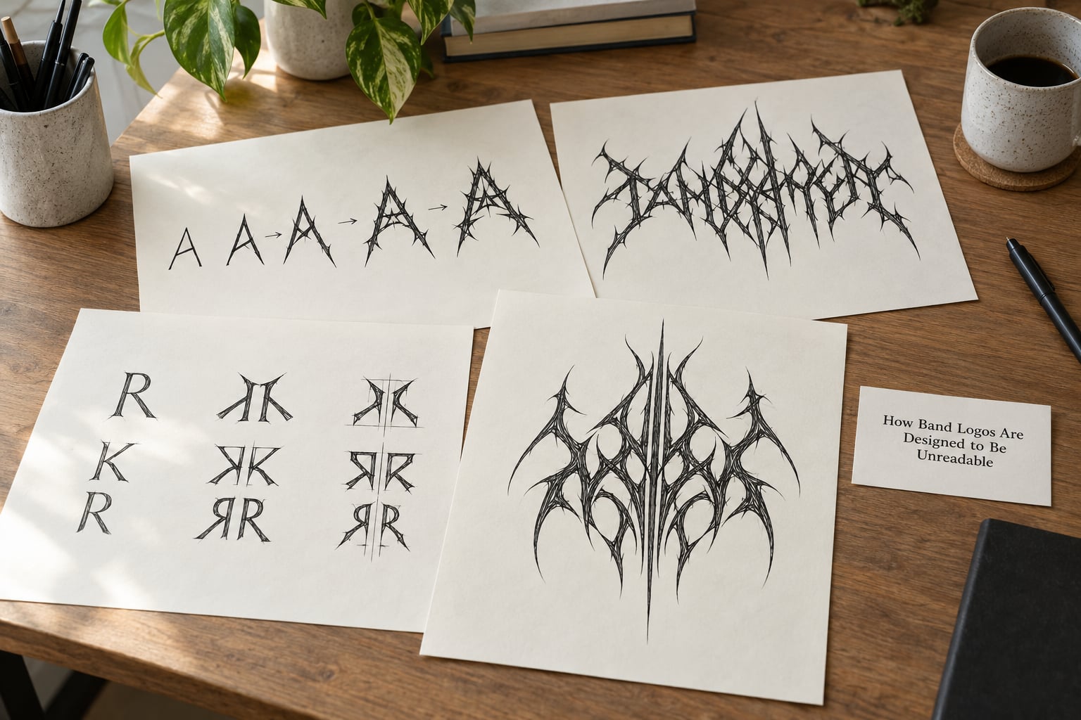
An unreadable metal band logo is a wordmark in which the individual letterforms have been deliberately deformed, merged, stacked, mirrored, spiked and ornamented, so the band name no longer resolves at a glance while still carrying genre and scene identity. It is not a failure of drawing. It is a set of repeatable transformations applied to a normal wordmark.
Two terms help. Legibility is whether you can tell which letters you are looking at. Readability is whether you can read the word. Metal logos routinely keep the second while surrendering the first, which is why a logo can be obscure for a year and then suddenly obvious once someone tells you the band name.
Letter recognition leans on a short list of features: a distinctive outline, a clear baseline, a consistent stroke direction, and the counters, which are the enclosed white spaces inside letters such as a, e, o and b. Take away the counters and the stroke contrast, and you get shapes that look like letters without being letters. Every technique below removes one of those features, and stacking several of them compounds the damage.
A University of Bergen Digital Lab lecture titled Illegible Semantics makes the useful point that these logos are not noise. They communicate sophisticated ideas about genre and emotional tone while breaking most of the rules people are taught about good typography. Illiteracy is the message, and the message survives the letters being unreadable.
How custom letterforms create visual tension in unreadable band logos
Most metal logos are drawn rather than typed. A designer starts with a workable typeface, then pushes it until recognition breaks. These are the eight moves that get them there, in roughly the order they tend to be applied.
1. Interlocking and merging. Adjacent letters share strokes, so the tail of one letter becomes the entry of the next. The word becomes a single continuous shape with no visible spaces, and the eye loses the spacing cue it uses to segment words into letters. This is the most common technique in the genre and the hardest to reverse later.
2. Vertical stacking and extreme compression. The name is broken across two or three lines and squeezed until each letter is tall and narrow. Tall narrow letters read as a stack of bars rather than a word, especially at thumbnail size. Bands built on a two-syllable name get the most out of this one.
3. Spike and thorn terminals. Every stroke ending grows a long tapered spike, usually swept backward along the reading direction. The spikes add weight, drama and a visible reading direction, and they also eat the space between letters. Extreme cases have spikes longer than the letters themselves, which makes any fine detail inside the letterform almost impossible to see.
4. Mirroring and mirror symmetry. Half a letter is drawn, then reflected across a vertical axis so the mark reads as one symmetrical shape. Symmetry feels ancient and ceremonial, and it is a nightmare for legibility, because half the letters are inverted and the eye expects left-to-right rhythm it never gets. The effect is elegant and almost never friendly to a first-time viewer.
5. Counter removal and closed apertures. The enclosed spaces inside a, e, o, b, d, g and p are filled, narrowed to slits or opened into long horizontal gaps. This is the single most effective move, because those counters are the fastest recognition cue we have. Letters collapse into ambiguous blobs that could be almost anything.
6. Irregular width and broken baselines. One letter is drawn twice as wide as its neighbour, or the baseline drifts up and down across the word. Irregularity signals that the mark is hand-made, which reads as authenticity in a genre built on hand-made records, and it removes the alignment that helps the eye chunk a word into units.
7. Chaotic ornament. Thorns, drips, splatter, webs, smoke, barbs and decorative filigree overlay the letterforms. This is the layer fans argue about most. Done well, ornament follows the strokes and supports the silhouette. Done badly, it is a downloaded spike brush stamped over generic text, and the logo ends up difficult to read without ever looking considered.
8. Invented or compounded names. Some of the hardest logos belong to bands whose names are not ordinary words. A portmanteau fuses two words into one invented form, and the wordmark has to invent a shape for a sound that has no dictionary spelling. The logo inherits the difficulty of the name, so the designer leans further into distortion to make the strange name feel intentional.
How symbols, monsters and abstract marks help
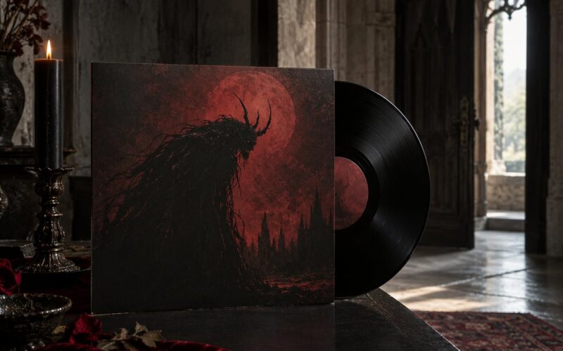
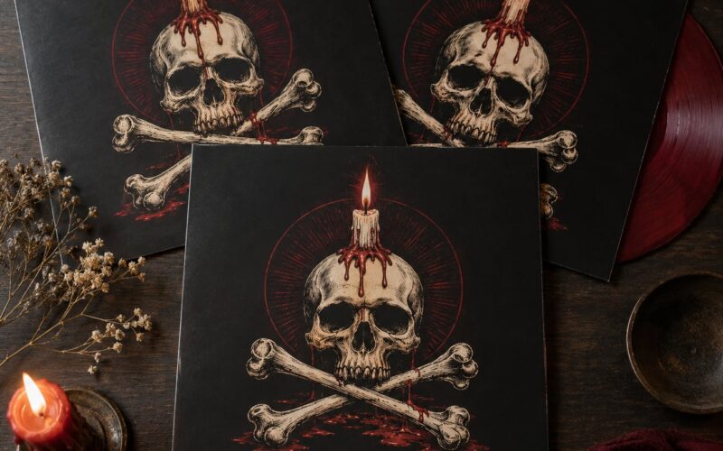
Because the wordmark alone cannot carry recognition, most bands pair it with a picture. A mascot, a heraldic pose, a weapon, a skull, an animal, a geometric sigil or a demon rendered in outline does the identifying work, and the letters become texture around it. The image reads instantly and the name is decoded later, which is exactly the intended order of operations.
Symbol meaning also shifts with size. On a jacket back patch, a dense illustration rewards close inspection and shows details that would be invisible on a streaming thumbnail. On a square avatar, only the outer silhouette survives, so the best emblems are designed to be identifiable as a shape before they are identifiable as a picture.
Occult and blasphemous imagery is common in this genre, so treat it as design vocabulary rather than a moral claim. Not every band with a pentagram or an inverted cross is making a statement; a lot of them are working with a visual tradition that has been handing down usable symbols for decades.
Is unreadability actually part of the design?
Sometimes yes, and the difference between a respected difficult logo and a mocked one is easier to describe than most fans admit. A deliberate logo survives four checks, and a lazy one fails at least two.
Does it hold up at small size? If the mark only works on a full-screen banner, it is decoration. Real designers test the thing small, because that is where the discipline shows.
Is the difficulty repeatable? The same name should stay hard to read across the album cover, the patch, the social avatar and the flyer. Inconsistency means nobody made a decision.
Is the construction visible? Symmetry, consistent spike geometry and clean joins tell you a person made choices. Random spikes of different lengths tell you a filter was applied.
Does the silhouette survive? Even fully illegible, the mark should have a distinct outline. A vague rectangular smear could be any band; a horned arch or a spiked oval could only be that one.
There is a real historical counterpoint here. A widely shared 2012 list of unreadable metal logos was already framing the style as a bad joke, and noted that sludge, doom and crust scenes had drifted back toward plain, easy type. Illegibility is now something a band chooses, not something the era chooses for it.
That same 2012 list also noted the exception that proves the rule: one of the founding black metal bands has one of the most readable logos in the whole genre. Harder is not automatically better. Sometimes a plain wordmark is the more abrasive choice, because it refuses to play the scene’s game.
Why designers test logos at every size
A logo is not a single image. It is a set of drawings that all have to point at the same band, and each size throws away different information. Good metal designers check the same artwork at five sizes before signing off.
Social avatar. A tiny square, often under 40 pixels across. Spikes survive as a fuzzy halo, counters vanish entirely, and only the outer contour and the colour block are doing any work. This is where emblems beat wordmarks.
Streaming and video thumbnail. Roughly 300 by 180 pixels, usually with a title overlay competing for the same space. If the band name cannot be read there, a new listener has no entry point, and no amount of obscure wordmark fixes that.
Venue banner and backdrop. Wide and viewed from fifteen metres. A compressed vertical stack turns into a wall of vertical bars, and symmetry is far more legible at distance than fine interior detail.
Merch stamp and embroidery. Very small and physically limited. A chest patch is often under eight centimetres across. Anything under a millimetre of stroke disappears, which usually means a simplified alternate version is needed rather than a shrunken copy.
Full lockup. Album cover or back patch, where the mark can breathe and the detail is rewarded. This is the only size where the interior of the letters is visible, so it is where the craft is meant to be noticed.
The practical rule I would give anyone commissioning this work: decide what must survive at the smallest size, then design backwards from that. Ornament is the first thing to go, not the silhouette and not the colour.
What metal bands achieve with difficult logo styles
Different subgenres use illegibility differently, and reading the difference is part of learning to read the logos. The canonical names that come up whenever people argue about unreadable metal logos, including Deathspell Omega, Nachtmystium, Darkthrone, Watain, Leviathan, Weakling and Xasthur, all sit in that black and death metal corridor, and the arguments online about whether a given logo is deliberate or lazy usually involve one of them.
Thrash metal, the parent of most of it, uses moderately distorted names: sharp, aggressive, and mostly readable. Black metal pushes further, with mirrored strokes, occult marks and runes. Death metal goes furthest, with dense thorn tangles, splatter and names that are hard to pronounce. War metal and blackened death tend toward illustration-first emblems with the name almost swallowed by the artwork. Doom and stoner rock usually keep the wordmark plain, sometimes to the point of looking like a hardcore band from the nineties.
Within the difficult end, you can still tell styles apart. A logo built on extreme symmetry reads as ceremonial and controlled. One built on stacked columns reads as claustrophobic and fast. One built on a single unreadable shape, with almost no internal detail, reads as eerie and restrained, and those minimal ones are often the hardest to dismiss, because there is nothing to critique.
Behind most of the serious work sits a small number of recurring specialists rather than a famous in-house designer. Gerrit “Tundra Toucan” Rijken is credited on the University of Bergen lecture as a working extreme-metal logo illustrator, and that pairing with a visualization professor is a fair summary of how the craft actually develops: someone drawing hundreds of these marks, then someone measuring what they have in common.
What is the process for designing an unreadable-style band logo?
If you are commissioning this or drawing it yourself, the order of operations matters more than the tricks. Here is a workflow that holds up.
1. Fix the band’s visual codes first. Decide what the music sounds like and what three or four visual motifs belong to it, before drawing a single letter. A logo that repeats motifs from the album art looks like part of a world; a logo drawn cold looks like a font with spikes.
2. Pick one typographic behaviour. Choose a single primary transformation, such as mirroring or compression, and treat everything else as restraint. Logos fail most often from having six techniques fighting rather than three working together.
3. Start from a working typeface, then break it. Build a clean, fully readable version of the name first, in one uninterrupted horizontal line, and save that file. Every deforming step gets measured against it, which is the only way to know whether you have broken the name or merely restyled it.
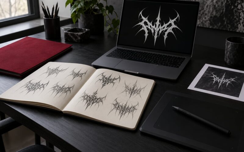
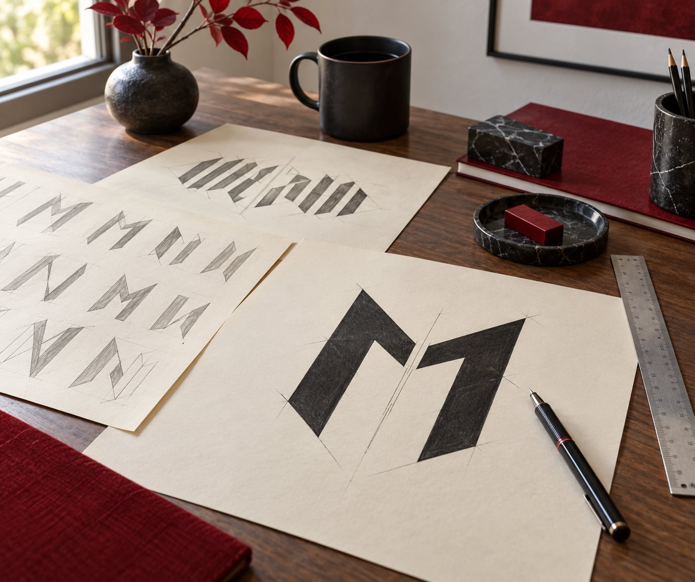
4. Sketch the letter-level modifications. Pencil passes for counter removal, interlocking joins and spike geometry. This is the stage where two things must stay true: every letter needs at least one remaining recognition cue, and the overall silhouette needs to be distinct from twenty other marks.
5. Design the emblem alongside the wordmark. If the name is going to be hard to read, the picture is carrying recognition, so it gets designed in the same pass rather than bolted on afterwards.
6. Redraw everything as vector. Hand-drawn work has to be rebuilt with clean paths, since embroidery, laser cutting and screen printing all need closed shapes and consistent stroke widths. Tools vary by budget, but the requirement is the same: scalable artwork with no raster texture baked in.
7. Test at every size, then check originality. Shrink it to avatar size, thumbnail size and patch size before approving. Run a reverse image search as well, because the genre’s most-used asset is other bands’ logos, and a mark that resembles an existing one will follow you around for years.
Budget for two or three rounds of revisions. The first version is almost always too dense, and the fix is subtraction rather than another layer.
Can a band logo be unreadable and still recognizable?
Yes, and the trick is that the word and the mark are recognized by different systems. Word recognition is fast and literal. Mark recognition is slower and works on shape, colour and repetition. A logo can be impossible to read as text and unmistakable as a picture, and that is the version of illegibility that actually works.
What survives is usually a stable silhouette, a limited and consistent colour block, a recognisable emblem, and repeated exposure. Fans do not decode a logo once. They see it on an album, then on a poster, then on a shirt at a show, and the shape accumulates meaning faster than any letter ever could.
Here is a rough method for reading one, adapted from how people actually argue about these logos online. Start with the shortest syllable and work outward, since it usually has the least ornament. Look for repeated letters, because a name is often printed twice in mirrored form. Check for vertical strokes that could be spikes rather than letters, and count spikes per letter to infer the word length. Then compare against the discography or the venue poster, where the name is usually printed somewhere in plain type.
The cost of all this is real. A listener who has never heard of the band sees a black shape on a small square and moves on, so discovery depends on word of mouth, a memorable emblem or a legible line of plain type somewhere else on the cover. Fans keep buying the difficult versions anyway. One recent thread on a music identification forum involved a hoodie picked up at a festival charity sale that nobody could read, which is a fair summary of how the scene actually consumes this work: people buy the silhouette first and read it later.
Frequently Asked Questions
Why do heavy metal band logos look difficult to read?
Because designers apply repeatable transformations to a normal wordmark: they merge neighbouring letters, fill in the enclosed counters that let you identify an a or an e, stack the name into a narrow column, mirror strokes for symmetry and attach long spikes to every stroke ending. Each move removes a feature the eye relies on, and combining several makes the name genuinely hard to parse. It is a deliberate choice, not bad drawing.
What makes a metal logo recognizable if the name is hard to decipher?
Shape, colour and repetition do the identifying, not the letters. A mark with a distinctive silhouette, a limited colour block, a recognisable emblem and a consistent geometry gets filed away as a picture, which is fast and reliable. Repetition matters most: fans see the same shape on an album, a poster and a shirt before they ever work out the word, so recognition usually arrives ahead of comprehension.
Should a band use an unreadable font or draw custom letterforms?
Draw custom letterforms. Metal fonts sold online usually deliver spikes, scratches and a blackletter base, which is why so many bands look interchangeable. Start from any real typeface, keep a clean readable version as a reference, then break it on purpose so you know exactly which features you removed. That approach is slower, but it produces a silhouette nobody else owns.
How small should a band logo be before it becomes illegible?
There is no single number, because ornament disappears long before the silhouette does. Test at the actual destination sizes: a social avatar, a streaming thumbnail around 300 by 180 pixels, and a chest patch under about eight centimetres wide. What must survive is the outer contour and the colour block. Fine interior detail can go without hurting recognition, and a simplified alternate version usually beats a shrunken copy.
Can an unreadable band logo still work on streaming services?
It can, but not on the wordmark alone. A small square thumbnail with no text is the hardest test a metal logo faces, and a listener who has never heard the band has nothing to decode with. Bands handle this by pairing the difficult mark with a clear emblem, a strong colour block or plain type elsewhere on the release. If the name matters for discovery, pair it with a legible one somewhere.
How do you redesign a logo that is too complicated for merchandise?
Start by deleting rather than redrawing. Strokes thinner than about one millimetre vanish in embroidery, so merge them and thicken the whole mark to a consistent weight. If the interior detail still cannot survive, split into two versions: a full-detail master for album art and a simplified alternate for patches, stamps and small print. Rebuild everything as closed vector paths so the artist is not scaling a raster file.
Conclusion
The strongest deliberately obscure logos are not unreadable by accident. Each one takes a readable wordmark, removes specific features on purpose, and keeps enough of a silhouette, a colour block or an emblem that the mark can be recognized long before the name can be parsed.
So how band logos are designed to be unreadable comes down to restraint plus precision: one or two transformations done well, tested at every size, with detail that rewards a second look. If you are drawing your own, settle the band’s visual codes and the readable base version first, then break only what you have decided to break.