Album art matters less in the streaming era for one reason above the rest: the cover no longer gets a moment of your attention. A vinyl sleeve or CD case hands you a square roughly 12 inches across and asks you to hold it. A streaming app hands you a thumbnail about the size of a fingernail, for a fraction of a second, inside a list you are already scrolling past.
That said, the artwork has not become worthless. It still carries genre signals, still holds together a band’s identity, still drives collectors to buy physical editions. What changed is the number of times a listener gets to look at it, and how much of it they can actually take in when they do.
Table of Contents
- How Streaming Changed the Role of Album Art
- What Streaming Interfaces Actually Show
- Why Album Art Matters Less in the Streaming Era
- The Main Reasons Album Visibility Has Declined
- Cover thumbnails keep shrinking
- Audio-first listening replaced album listening
- Recommendation feeds ended visual browsing
- Liner notes and credits became unreachable
- Variant covers fragment the image
- The physical browsing ritual faded
- What Album Art Still Does for Metal Music
- How Collectors and Musicians Can Keep Art Meaningful
- Frequently Asked Questions
- Is album art becoming irrelevant in the streaming era?
- Why do small album thumbnails make artwork harder to appreciate?
- Does streaming reduce the value of physical album artwork?
- How do streaming playlists help listeners discover metal bands?
- Should metal musicians still invest in strong album artwork?
- Can album art influence which music listeners stream?
- Conclusion
How Streaming Changed the Role of Album Art
Album covers only became a designed object in the late 1930s, when commercial artist Alex Steinweiss started treating the record sleeve as an advertisement for the music inside. Before that, plain paper bags were the norm, and listeners had no visual cue at all.
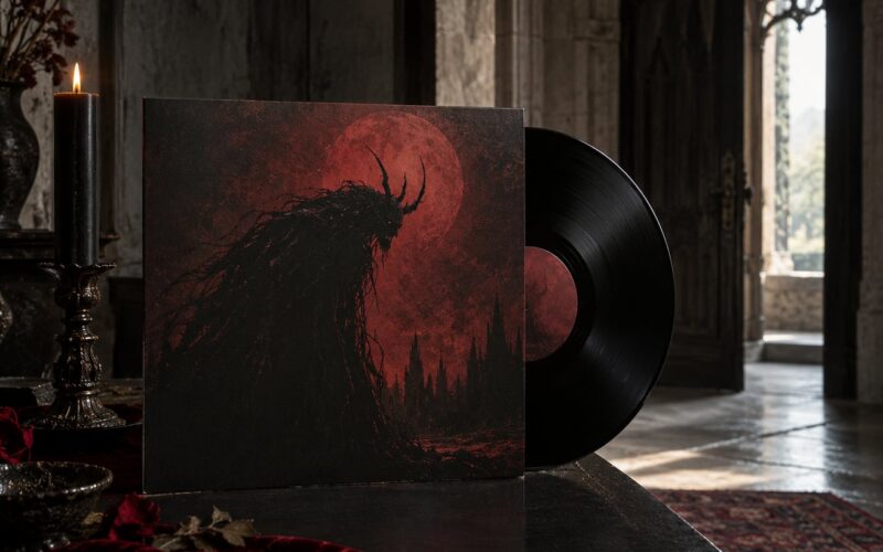
For decades the physical object carried most of the browsing experience. You flipped through racks, read the back of the sleeve, checked the track listing, and read small print credits. Metal releases leaned into this harder than most genres, with gatefolds, photocopied booklets, fantasy illustration, and inserts that only made sense folded open.
Streaming inverted that relationship. The cover became an identifier, something like an icon next to a song title. You still see it constantly, but you read it as interface furniture rather than as artwork, because the interface has other jobs: queue position, shuffle order, play count.
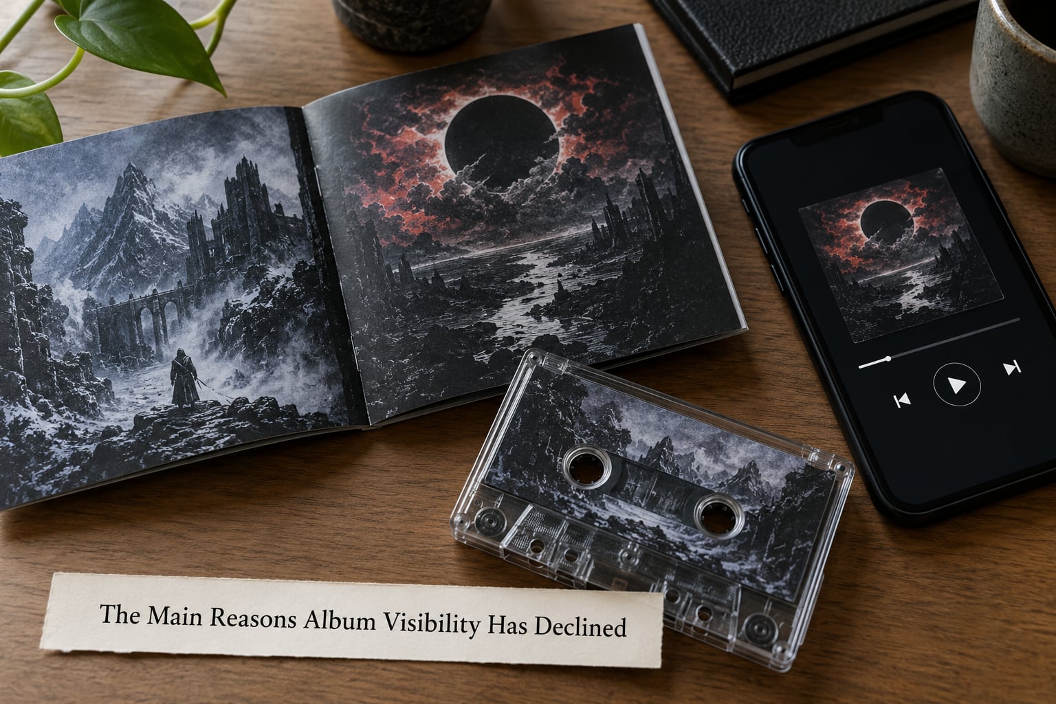
The practical difference for a metal release is stark. A double-width gatefold sleeve unfolds into a scene that spans 24 inches of horizontal space. Fold that same image into a 1:1 square for a streaming profile and you have cropped it. Artwork made to be explored in the hands arrives as one compressed frame.
What Streaming Interfaces Actually Show
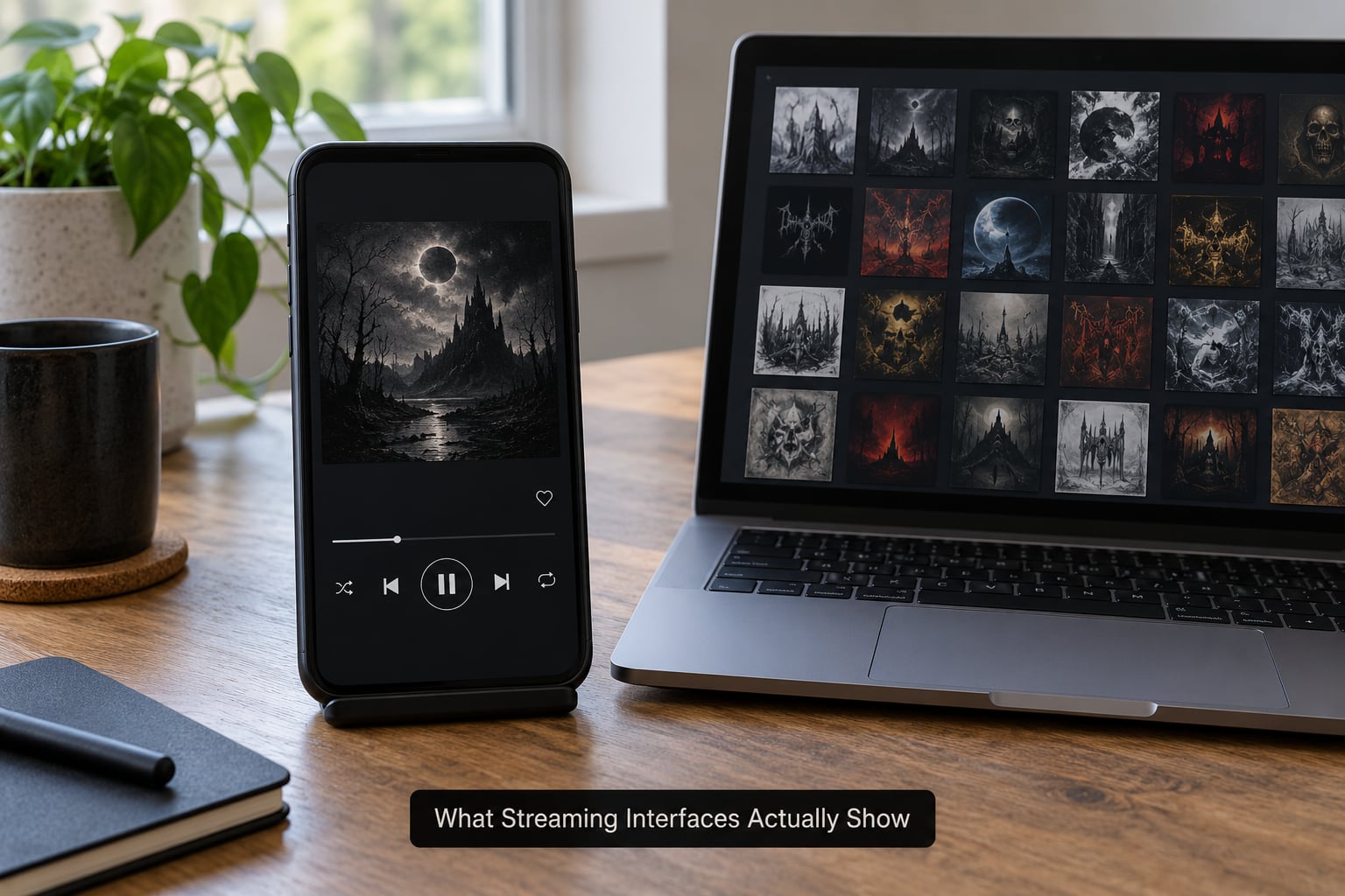
The same cover appears at a dozen sizes across a typical streaming session, and only one of them is large enough to read detail on. What you can actually take in changes completely depending on where the cover happens to be sitting on the screen.
| Touchpoint | What you see | What the art loses |
|---|---|---|
| Library grid | Small square tiles, several per row | Fine line work, small text, signature details |
| Playlist row | A tiny square beside a track title | Everything except the general colour and mood |
| Search results | Thumbnail aligned with artist and title | Any distinction between editions |
| Album page header | A medium square, roughly 300 pixels on mobile | Gatefold compositions built for width |
| Now playing screen | Full device width, edge to edge | Nothing, but only after a track is already playing |
| Editorial playlist grid | Rows of small covers, often many at once | The ability to stop and browse |
Users on music forums talk about this constantly. The most common complaint is the gap between the now playing view, which they describe as huge, and the list view, which is nearly unreadable. Blank or missing thumbnails are the other big one, since a broken cover in a grid of forty albums ruins the whole browsing moment.
Spotify’s Canvas feature, a short looping visual that plays in place of the static cover, was built for exactly this gap. Listeners on forums praise the loops for making an album feel alive while a track runs, though the same people note they do not appear on every platform or app version, so the same release can look completely different from one device to the next.
Why Album Art Matters Less in the Streaming Era
The honest answer is a stack of three things: fewer viewing moments, a different entry point, and a discovery system that does not care what the cover looks like.
On viewing moments, the shelf or rack forced a pace. Turning an album over took seconds, and you looked at the front, the back, and the inner sleeve before deciding. In a streaming session the cover is visible for maybe one second per song, and only when the interface happens to show it at all.
On entry point, plenty of listeners never arrive at an album through an album. Recommendations hand over a single track, a playlist surfaces a song they half recognise, and the cover shows up afterwards as confirmation rather than as the thing that pulled them in. When the music leads, the art is playing catch-up.
On discovery, platforms rank audio. Search results are sorted around artists, titles, and playback data. A striking cover is no longer a browsing shortcut, because there is no browsing shelf to shortcut through. It is decoration attached to a catalogue entry, and good decoration earns a moment, not a decision.
The Main Reasons Album Visibility Has Declined
Cover thumbnails keep shrinking
A thumbnail is a reduced copy of the cover used wherever the full image will not fit, usually in a grid or a list. As apps added more content to the same screen, the tiles got smaller to fit. Detail that survives on a 300-pixel square disappears entirely at the size of a playlist row.
Audio-first listening replaced album listening
The album was always a bundle. Streaming unbundles it, and a listener who takes three songs from four different records has never seen a single gatefold. When consumption is per-track, the cover is no longer the doorway to a body of work.
Recommendation feeds ended visual browsing
Algorithmic radio and editorial playlists fill the queue, so there is no shelf left to browse. Discogs-style hunting through crates, where a cover pulled you toward an unfamiliar band, has no digital equivalent on a home screen.
Liner notes and credits became unreachable
The back cover used to hold the credits. On streaming, the credits view gives names for performers, producers, and writers, and the person who painted or photographed the cover is often absent entirely. Forum discussions about cover artists being unknown come back to this gap repeatedly: the work travels, the credit does not.
Variant covers fragment the image
When a release ships with several alternate covers, each version is attached to the same track list. The result is a different image depending on which edition your app serves, which makes the cover a less reliable identifier than it used to be. Designers describe the frustration of building a visual identity that gets swapped out across storefronts.
The physical browsing ritual faded
Going into a record shop meant seeing hundreds of covers at once, all competing, all legible. That visual density did not survive the move to a phone screen. Metal lost one of its best discovery channels along with it.
What Album Art Still Does for Metal Music
Metal is unusually well served by artwork, which is why the decline stings more here than in genres with flat, minimalist sleeves. The cover is doing genre work before a single riff starts.
- Genre signalling. A black-and-white photo, a corpse, a forest, a geometric sigil. Metal listeners read the cover before the label, and a mismatch sends them elsewhere in seconds.
- Band identity. A consistent visual language across a discography makes a back catalogue recognizable. Fans notice when an artist’s art style shifts wildly between releases.
- Visual storytelling. Concept records still ship with illustrated booklets, and bands still build lore that the artwork carries. On streaming that material is often a single compressed square.
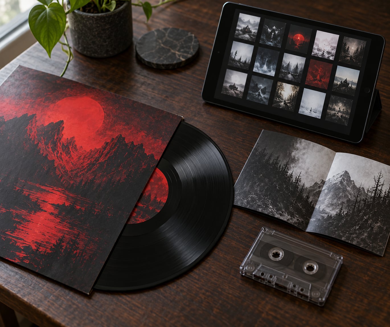
- Collector attachment. Gatefolds, coloured vinyl, inserts, and variant editions are collected because of how they look in hand. That is the one place the art still gets its full canvas.
- Merchandise and social sharing. Tour shirts, posters, and social posts all reuse the cover, and the square format is one of the few images that survives every platform intact.
- Recognition in reverse. With audio-first listening, many fans identify a band by sound and then check the cover afterwards. The art works as confirmation and memory anchor, which is a different job than discovery.
How Collectors and Musicians Can Keep Art Meaningful
None of this is a call to abandon streaming. It is a set of habits that restore the part of the art that a thumbnail cannot carry.
- Buy the physical edition once. A gatefold sleeve or an illustrated booklet is the only format where the composition is designed for its real size. One copy per favourite record changes how you look at it.
- Keep it visible. Records filed flat out of sight do the same job as a thumbnail. A shelf, a frame on the wall, or a stand on the desk gives the cover an audience.
- Share high-resolution images. Band social accounts, fan pages, and YouTube uploads put full-size art in front of people who never buy vinyl, at no cost to the artist.
- Credit the cover artist. Bands can name the designer and photographer in the release post, on the physical sleeve, and in their own site copy. Forum listeners notice and care when the work is attributed.
- Use Canvas with intent. An animated loop made for eight seconds reads very differently from a still image, so it needs a motif, not decoration. Ask before using it as a substitute for a real sleeve design.
- Talk about the artwork. Interviews, reviews, and channel descriptions that discuss the concept behind a cover give the design a second life, and give new listeners a reason to look it up.
- Check the metadata. Wrong or mismatched covers frustrate listeners badly. Bands uploading clean artwork once saves them from being displayed with the wrong image on some platforms.
Frequently Asked Questions
Is album art becoming irrelevant in the streaming era?
Not irrelevant, but rarely the deciding factor. Streaming shrunk the cover to a thumbnail and moved discovery to audio, so artwork now confirms an album rather than selling it. It still carries genre signals, band identity, and collector value, and physical editions still give the art its full intended size.
Why do small album thumbnails make artwork harder to appreciate?
Because detail scales with pixels. Fine line work, small text, and signature details vanish on a tile the size of a playlist row, and a cover designed as a wide gatefold composition gets cropped to a square. You are seeing a fraction of what the artist made, at a size that gives it no time to land.
Does streaming reduce the value of physical album artwork?
It raises it. Physical packaging is now the only format where a cover is shown at its designed size, with full print detail, gatefolds, inserts, and credits intact. Collectors report caring most about large-format artwork precisely because the digital version shows so little of it.
How do streaming playlists help listeners discover metal bands?
They replace the record shop. Editorial playlists and recommendation feeds surface bands you did not know, often with no context, so the thumbnail and the track itself do the introducing. The trade-off is volume and speed for intent: far more discovery, far less browsing on your own terms.
Should metal musicians still invest in strong album artwork?
Yes. The cover is the fastest genre signal a metal band has, it carries the identity across a back catalogue, and it drives physical sales, merch, and social posts where the square format survives. Spending on artwork helps everywhere except the thumbnail, which it can never win.
Can album art influence which music listeners stream?
Less than it used to, and mostly at the moment of choice. A playlist grid, a search result, or a recommendation card can still push someone toward an unfamiliar record, but ranking is driven by audio and play data, not by looks. Artwork shapes attention rather than algorithm outcomes.
Conclusion
So why album art matters less in the streaming era comes down to attention, not worth. The cover still says what a record is about, still identifies a band, and still sells physical editions. It just no longer gets the seconds of undivided looking that made it part of how music was discovered.
Start with the next album you play: notice whether you recognised the band from the sound before you saw the cover, and whether you ever looked at the cover at all. Then find the physical edition of a record you love and pull out the gatefold. That gap between the two experiences is the whole argument.