Horror movies gave metal a whole visual vocabulary to borrow: masked killers, giallo colour palettes, occult ritual, rotting zombies and practical-effects gore. Bands took that vocabulary straight into album sleeves, mascot design, stage sets, costumes and music videos, from Derek Riggs painting Eddie in 1981 to Vince Locke drawing Cannibal Corpse’s corpse farm. Updated for October 2026.
What follows is the map: which traditions were borrowed, where the borrowing shows up, which films fed which bands, and how to separate a documented homage from your own pareidolia.
Table of Contents
- How Horror Movies Influenced Metal Imagery
- From Gothic Dread to Cosmic Horror
- What Horror Visual Traditions Did Metal Bands Adopt?
- Where Does the Influence Appear in Metal Imagery?
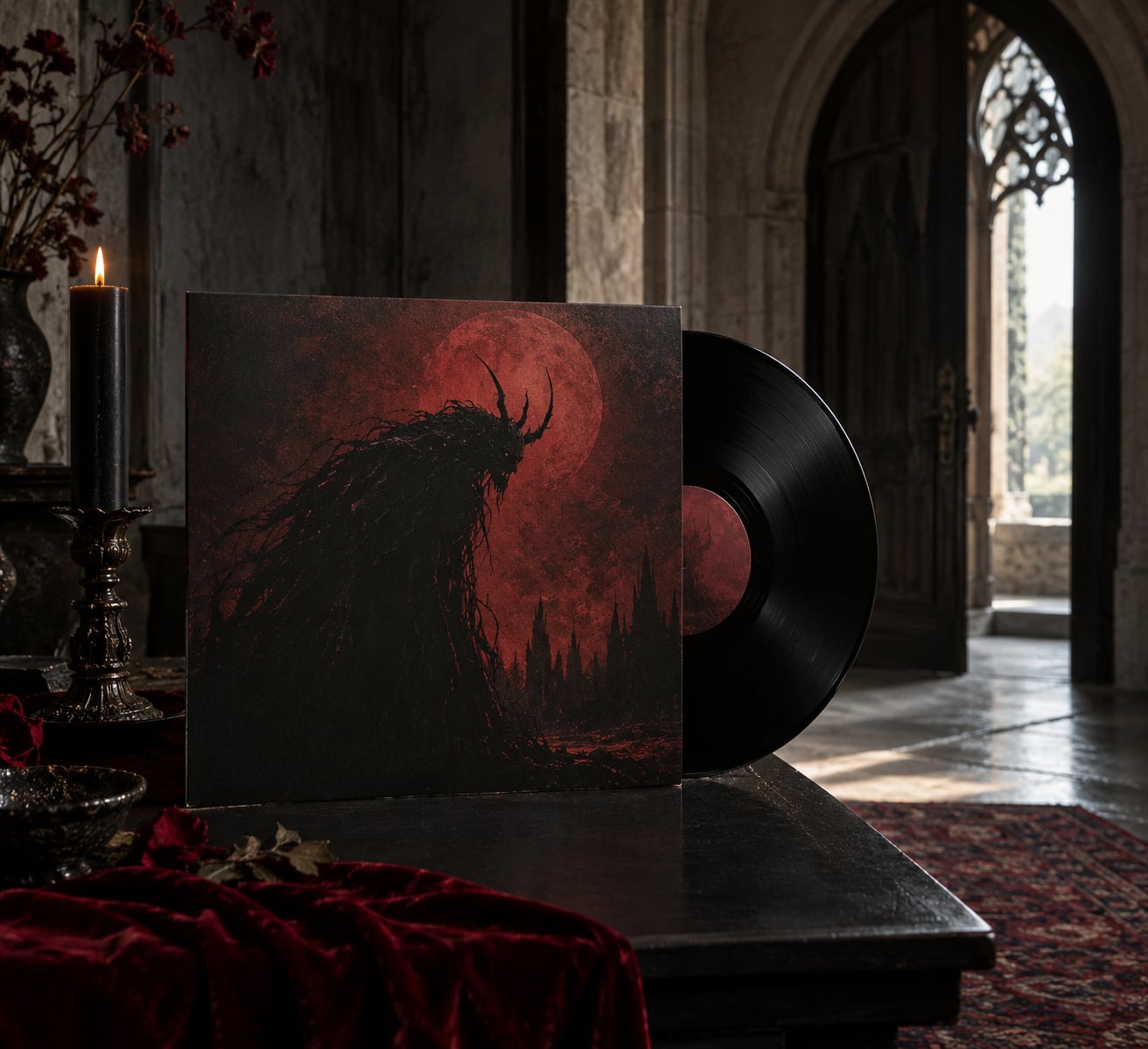
- Album Art and Packaging
- Lyrics, Concepts, and Narrative Themes
- Stage Design, Videos, and Band Personas
- Which Horror Eras and Films Shaped Metal’s Visual Language?
- How Can You Tell Influence From Shared Symbolism?
- Frequently Asked Questions
- Did heavy metal bands take their imagery directly from horror movies?
- Which metal bands have the clearest horror movie influences?
- Is horror imagery only associated with extreme metal?
- How did horror movies influence metal stage shows and band personas?
- How can I tell whether a metal album cover is a horror-film homage?
- Is Iron Maiden’s Eddie evil?
- Conclusion
How Horror Movies Influenced Metal Imagery
Horror cinema supplied metal with four things: a set of visual themes, a set of character types, a production vocabulary of effects and lighting, and an emotional atmosphere of dread and violation. Metal bands translated all four into album artwork, concept albums, music videos, stage design and frontperson personas.
One qualification worth holding onto from the start. The influence is rarely a single film copied onto a sleeve. More often it is a cinematic language — a way of lighting a face, framing a body, staging a reveal — that bands absorbed from watching the same movies the audience was watching.
From Gothic Dread to Cosmic Horror
The oldest layer is Gothic. Castles, crypts, candlelight and inherited curses reach back through The Cabinet of Dr. Caligari (1920) and the Universal monster films of the 1930s into the satanic drama of Hammer Film Productions. That tradition gave metal its architecture of decay, and it is why crypts and cloisters still show up on death metal sleeves.
The second layer is cosmic horror: the idea that the threat is larger than any person can comprehend. Alien (1979) and The Thing (1982) turned that into cold, industrial dread, and metal took the aesthetic rather than the plot — starfields, derelict structures, and machinery that keeps moving after everyone inside it is gone.
The third layer, the one most readers mean when they ask this question, is the 1980s exploitation explosion. Slasher killers, hockey masks, machetes, haunted houses and splatter makeup flooded out of Halloween (1978), Friday the 13th (1980), The Evil Dead (1981) and Hellraiser (1987). That is the wave metal imagery drew on most heavily.
What Horror Visual Traditions Did Metal Bands Adopt?
Once you know the traditions, the sleeve art stops looking random. Here is the recurring vocabulary and where each piece comes from.
| Visual tradition | Cinematic source | Metal application |
|---|---|---|
| Gothic architecture and crypts | German expressionism, Hammer horror | Candlelit crypt scenes, cloister backdrops, tomb interiors on death metal sleeves |
| The masked killer | Halloween (1978), Friday the 13th (1980) | Mascot design, hockey mask logos, merch and the hockey-mask corpse paint tradition |
| Splatter and practical gore | The Texas Chain Saw Massacre (1974), Friday the 13th | Exposed organs, chain saws, hung bodies, practical-makeup texture on sleeve paintings |
| Giallo colour and voyeurism | Blood and Black Lace (1964), Deep Red (1975), Suspiria (1977) | Saturated primaries, red-and-blue palette clashes, black gloves, stained-glass framing |
| Rotting corpse crowds | Night of the Living Dead (1968), Dawn of the Dead (1978), Zombi 2 (1979) | Zombie themes in lyrics, shambling stage movement, decaying-crowd sleeve compositions |
| Possession and ritual | The Exorcist (1973), The Beyond (1981) | Inverse crosses, inverted pentagrams, hooded figures, possessed-character album concepts |
| Monsters and creature design | Japanese kaiju films, Alien (1979) | Alien silhouette and biomechanical detail in band logos, cosmic horror sleeve art |
| Psychological wrongness | Shutter Island, The Silence of the Lambs (1991) | Uncanny faces, dolls and mannequins, cover scenes that hide something in the background |
Where Does the Influence Appear in Metal Imagery?
Album Art and Packaging
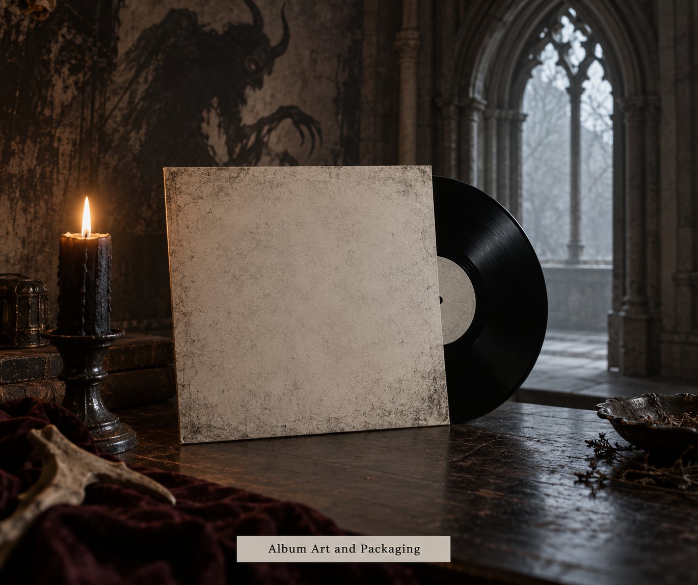
This is where the influence is easiest to see and the hardest to fake. Iron Maiden’s mascot Eddie started life on Killers (1981) as a decaying figure with a razor’s edge, painted by Derek Riggs, and he has been re-posed as a horror-film villain ever since. The band later cut a song called “22 Acacia Avenue” for A Nightmare on Elm Street 5 (1988), which made the connection explicit in both directions.
Cannibal Corpse took the practical-effects side of horror as literally as any band. Vince Locke built a corpse on every cover through the 1990s, and the sleeves borrow the grammar of 1980s gore makeup — matte paint, hard shadows, visible prosthetic seams. Ed Repka gave Megadeth a matching set of grotesque characters in the Vic Rattlehead era, and Dan Seagrave turned to cosmic and industrial desolation for Death and Obituary. Michael Whelan’s Metallica work pushed in a different direction, borrowing the grim industrial scale of Alien-era production design.
Some of these links are documented and some are not. The Misfits’ Crimson Ghost comes from a comic-book character, but their hockey mask and Ghostbusters homage are unmistakably Jason Voorhees. That mix of sourced and instinctive is normal, which is why the last section of this guide matters.
Italian horror gives sleeve designers a grammar rather than a character. Giallo colour — stained glass, saturated primary light pushed through a night scene, gloves and leather against clean skin — reads as horror even when no monster is present. A painter working in metal can study the way an Argento scene holds a single shadow and borrow that without lifting a character or a plot.
Metalography is the word for taking sleeve art seriously as its own art form, and horror is where the craft standards came from. Horror comics and exploitation posters had decades of professional horror art behind them before any metal LP existed, so bands inherited a visual language rather than inventing one from nothing.
Lyrics, Concepts, and Narrative Themes
Horror supplies plot shapes as well as pictures. Possession, cults, haunted places, monsters, forbidden knowledge, a slow breakdown of a mind, an ending that takes everyone. Metal runs those shapes through concept albums and recurring characters, so a record can behave like a feature film rather than a collection of songs.
Dokken’s “Dream Warriors” (1986) is the clearest licensed crossover, written for A Nightmare on Elm Street 3. Pantera recorded “Trouble in Texas” and “Revolution Is My Name” for Tales from the Crypt: Demon Knight (1995), the same film that also collected Ozzy Osbourne and Gene Simmons. Motörhead’s “Hellraiser” (1987) came with a pinball machine and a soundtrack slot in the same month.
Stage Design, Videos, and Band Personas
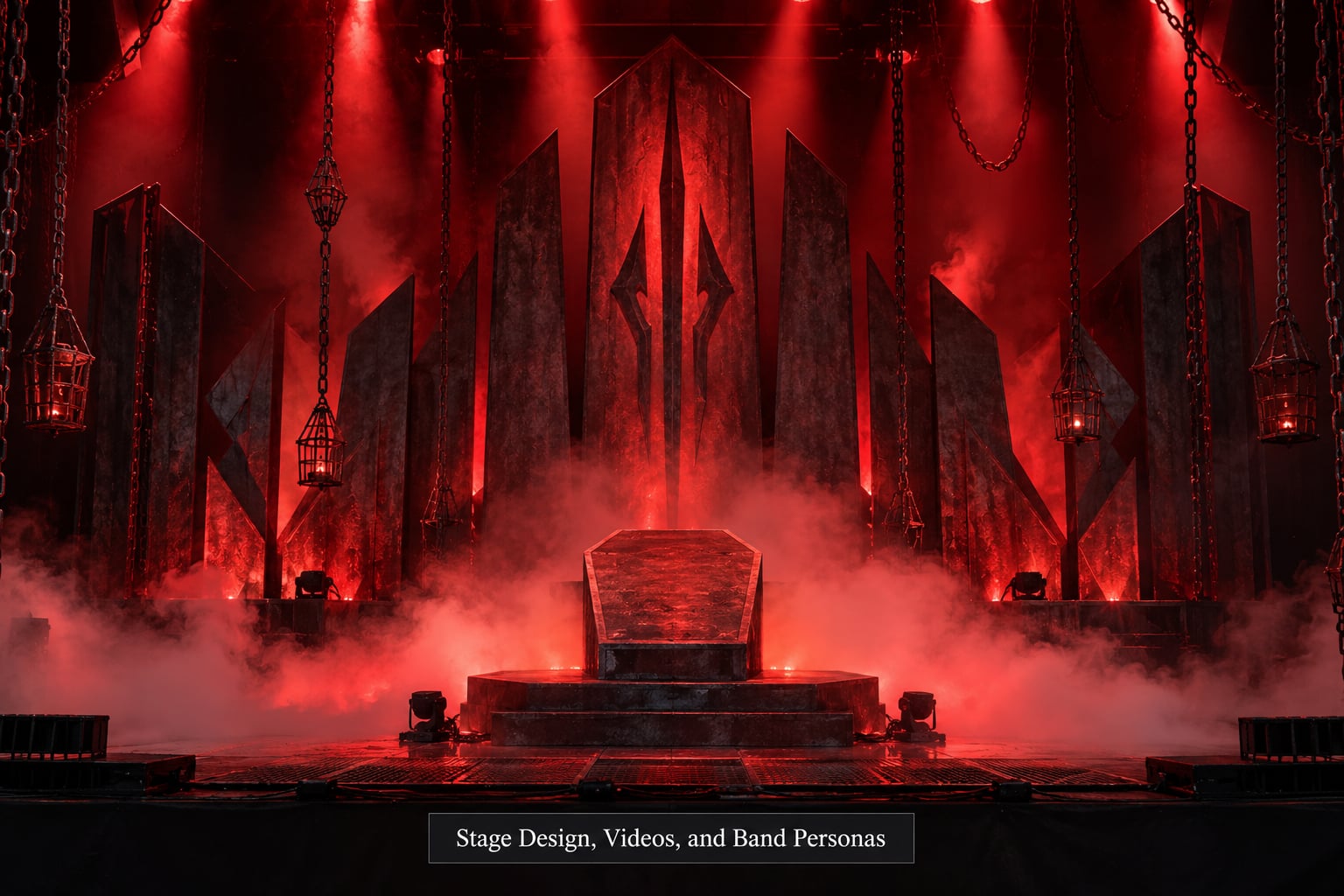
Live is where a visual reference becomes a character. A mask that reads as generic on a sleeve becomes a face with a name and a history the moment a frontperson puts it on every night. Corpse paint, robes, inverted crosses and staged blood effects all descend from the same haunted-house and ritual imagery that fills the films.
Modern bands push the same idea with less gore. Ghost built a whole papacy around masked frontmen, and Sleep Token hides its singer entirely, so the image is the point rather than the decoration. Motionless In White is the band horror fans mention most often for a visual identity that reads as slasher cinema without borrowing a single existing character.
That vocabulary also survives the point where the shock wears off. Horror gives a band a safe place to be frightening, and fans describe the effect in their own shorthand — doom metal vibes, Halloween vibes, sleaze. The imagery promises a controlled scare, and the live room is the one place the audience has agreed to take it literally.
Which Horror Eras and Films Shaped Metal’s Visual Language?
The table below pairs films with the bands and records that took something specific from them. Some pairings are documented by the artist or designer, others are structural parallels, and the final column tells you which kind of claim each row is making.
| Film | Year | Band or album | Year | Visual device borrowed |
|---|---|---|---|---|
| The Cabinet of Dr. Caligari | 1920 | Expressionist lineage behind 1970s occult rock sleeves | 1970s | Twisted angles, shadow-as-character, the monstrous as human |
| Night of the Living Dead | 1968 | Zombie conventions across US death metal | 1980s onward | Shambling crowd, rural decay, no rules for the threat |
| The Exorcist | 1973 | Occult metal iconography | 1980s onward | Inverse cross, possession as a possession narrative |
| The Texas Chain Saw Massacre | 1974 | Iron Maiden Eddie artwork | 1981 onward | Leather-mask brutality, the smiling figure with a tool |
| Halloween | 1978 | Blue Öyster Cult, “Don’t Fear the Reaper” | 1978 | Michael Myers as the template for the silent slasher mascot |
| Alien | 1979 | Cosmic-horror sleeve art, band logo design | 1980s onward | Biomechanical silhouette, industrial corridors, dim tunnels |
| The Evil Dead | 1981 | Sam Raimi imagery in metal video and stage design | 1980s onward | Possession, grisly humor mixed with genuine terror |
| Friday the 13th | 1980 | The Misfits, Jason mask logo and merch | 1979 onward | Hockey mask as brand mark; the mask moves from film to shirt |
| A Nightmare on Elm Street 3: Dream Warriors | 1986 | Dokken, “Dream Warriors” | 1986 | Sleep-deprivation scars, dream logic, child victims as heroes |
| Hellraiser | 1987 | Motörhead, “Hellraiser” | 1987 | Puzzle-box torture, Cenobites, self-inflicted pain |
| The Silence of the Lambs | 1991 | Psychological-horror sleeve compositions | 1990s onward | Stillness before violence, the antagonist as intellectual |
Two eras matter most. The 1950s through 1970s built the template — shock rock from Screaming Lord Sutch onward, Alice Cooper’s theatrics, Black Sabbath’s occult titles — and gave metal the habit of treating the stage as a horror set. The 1980s gave it the costume and the catalog.
Then came the panic. Through the mid 1980s, the Parents’ Music Resource Center and a wide media campaign treated inverted crosses and skull covers as evidence of moral danger rather than decoration. Bands responded by doubling down, which is why the imagery sharpened exactly when it was being attacked.
How Can You Tell Influence From Shared Symbolism?
Skulls, demons, blood and darkness are everywhere in metal and everywhere in horror. None of that is proof of anything on its own. There is a practical way to sort it out, and it starts with asking whether anyone ever said it.
Start with attribution. A named interview, a liner note, a designer crediting a film, or a sleeve artist explaining a reference is evidence. A resemblance on its own is not. Fans in the Iron Maiden community are rightly skeptical of elaborate cover-by-cover theories that no one can source — the skeptic’s position is simply that a striking image looks like a lot of other striking images.
Then check chronology and repetition. A film that predates the record, a device that recurs across the band’s visual identity, and a specific transferable technique like a palette or a lighting angle all add up. A single ambiguous resemblance does not.
The reverse direction is a useful control. Horror films have long borrowed metal iconography rather than the other way around, which proves how much the two styles trade. Stranger Things put Iron Maiden’s “Run to the Hills” under the season two finale fight scene. They Live (1988) soundtracked a bar brawl with Crash and the Boys. Deathgasm (2021) built its entire premise on the marriage of slasher cinema and metal. When a film can put a band’s song at the emotional peak of a scene, the cultural overlap is clearly running both ways.
Frequently Asked Questions
Did heavy metal bands take their imagery directly from horror movies?
Partly. Some connections are documented: Iron Maiden wrote “22 Acacia Avenue” for A Nightmare on Elm Street 5, and Derek Riggs has discussed horror film influence on Eddie. Much of the rest is a shared cinematic language rather than a direct copy. Bands absorbed lighting, framing and gore density from the same films their fans watched, then rebuilt it in their own style.
Which metal bands have the clearest horror movie influences?
Iron Maiden, through mascot Eddie and its direct film song pairings. Cannibal Corpse, whose sleeves deliberately imitate practical-effects gore makeup. The Misfits, with the hockey mask lifted from Jason Voorhees. Megadeth, Mercyful Fate and King Diamond, where theatrical horror framing drives the live show as much as the records.
Is horror imagery only associated with extreme metal?
No. Blue Oyster Cult put “Don’t Fear the Reaper” on the era’s defining horror film, and AC/DC, whose Maximum Overload was named after a Stephen King movie, sits just as far from death metal. Much of the vocabulary lives in hard rock and heavy metal generally. Subgenre labels predict the intensity of the imagery, not whether horror is present at all.
How did horror movies influence metal stage shows and band personas?
They supplied the mask, the costume and the ritual. Corpse paint, robes and staged blood descend from haunted-house and possession imagery, and a mask worn nightly stops being a graphic and becomes a character with a name. Modern acts push the same principle with restraint: Ghost uses masked frontmen, and Sleep Token builds an identity around total concealment.
How can I tell whether a metal album cover is a horror-film homage?
Look for attribution first: a named interview, a liner note, or a sleeve artist crediting the film. Then check whether the film predates the record and whether the device recurs across the band’s visual identity. A specific borrowed technique, like a giallo palette or a prosthetic-gore texture, is stronger evidence than a general resemblance to darkness and skulls.
Is Iron Maiden’s Eddie evil?
Not reliably. Eddie began as a decaying figure with a blade and reads as a monster, but Derek Riggs has described the character as a victim with a crumbling body rather than a straightforward villain. On later covers Eddie is as often a target as a threat. Treating him as a metal villain is the most common fan reading, and the most documented one.
Conclusion
Horror movies influenced metal imagery by handing the genre a ready-made visual language that bands could put on a sleeve, on a stage and on a shirt, and that films later borrowed back. The strongest evidence sits in sleeves and song pairings; the weakest sits in anything you inferred from a skull.
Start with one film and one cover. Take a giallo picture like Suspiria or Deep Red, note its palette, its framing and its use of negative space, then put the same three notes next to a Cannibal Corpse or a Dan Seagrave sleeve. After that, check whether a designer or the band ever named the source, because that answer decides whether you found an homage or a coincidence.