How metal album covers are designed comes down to a short repeatable chain: a band, its label or its manager writes a brief about the songs and the subgenre, an illustrator or designer develops three visual concepts, and the chosen one is built into a full package before it is exported at 3000 by 3000 pixels for streaming and at 300 DPI with bleed for vinyl. Metal gets its own visual language because the genre inherited its imagery from fantasy paperbacks, religious engravings and horror cinema rather than from pop photography.
The rest of this guide walks through that process in order: where the visual language came from, what makes a cover work, how to pick a direction, why skulls and sigils keep showing up, how to handle color and lettering, and what actually happens between the finished painting and the record arriving in a sleeve.
Table of Contents
- Why Metal Album Covers Look the Way They Do
- What Makes a Metal Album Cover Work?
- How Metal Album Covers Move from Idea to Release
- Choosing a Visual Direction for the Music
- Symbols, Characters, and Visual Shock
- Color, Typography, and Composition
- How Metal Album Covers Are Designed
- Photography, Illustration, and Digital Production
- Printing, Formats, and Shrinking to a Thumbnail
- How Bands and Designers Avoid Cover-Art Mistakes
- Frequently Asked Questions
- Who actually designs metal album covers?
- How long does it take to design a metal album cover?
- Can a band use AI-generated artwork for a metal album cover?
- What should a band give the designer before work starts?
- Does a metal album cover have to be original?
- Why are death metal logos so hard to read?
- Where to Start with a Metal Album Cover
Why Metal Album Covers Look the Way They Do
Metal album covers look the way they do because the genre grew up inside mail-order fantasy art and second-hand paperbacks. The visual grammar of heavy metal was borrowed, deliberately, from sources with a very specific mood: Frank Frazetta and Ken Kelly sword-and-sorcery paintings, medieval religious woodcuts, H.R. Giger’s biomechanical drawings, and horror film posters that promised gore in a single image.
That inheritance explains a lot of what looks strange about metal artwork to people outside the genre. A demon isn’t a random shock tactic. It is a direct quotation of the paperback that told a sixteen-year-old what the music was going to feel like before they heard a note of it.
The eras each left a different fingerprint on the format:
- Late 1970s to mid-1980s: hand-painted fantasy borrowed straight from paperback and trading-card art. Sword, castle, warrior, dragon. The music was fast and the pictures were epic and slightly cheesy on purpose.
- Late 1980s and 1990s: airbrush photorealism, the style pushed by artists like Ken Kelly and Roger Dean. Figures became anatomically impossible, skies turned orange, and covers started looking like airbrushed truck murals.
- Late 1990s and 2000s: death metal chaos. Legible lettering was abandoned on purpose, imagery turned to body horror and gore, and photocopy grain and lo-fi scans became an aesthetic choice rather than a budget failure.
- 2010s onward: a slow drift toward restraint. Band photography, brutalist typography and single-concept minimalism appear constantly now, largely because covers are being seen as 160-pixel squares on phones rather than as 12-inch sleeves in a record shop.
Two newer pressures have bent the language again. Extreme subgenres embraced raw, photocopied, deliberately ugly imagery as an authenticity marker. And since 2026, AI image tools have made dense surreal compositions cheap to produce, which pushed some bands toward clean, minimal covers that are harder for a generator to imitate.
What Makes a Metal Album Cover Work?
A metal cover works when it does six things at once. Most covers in the genre fail at three of them.
- One dominant idea. A single image or a single concept carries the cover. When a designer presents three competing focal points, the eye has nowhere to land.
- Instant genre legibility. A listener scrolling a playlist should know the subgenre before reading the artist name. That is a shorthand system, and every band in a subgenre is deliberately using it.
- Emotional temperature. Dread, defiance, sorrow and mania are all valid. A cover that looks cheerful, or that looks like a corporate tech advertisement, fights the music.
- Contrast. Metal covers are mostly dark, so the things that matter have to be brighter than their surroundings or nothing reads at all.
- Typography with a job. The lettering either tells you the band and album instantly, or it deliberately refuses to. There is no in-between.
- Thumbnail survival. If the cover collapses into an unreadable grey smudge at small size, the concept has failed for most listeners today.
The cover also has to be honest to the record. Fans are unusually good at spotting art that promises something the music does not deliver, and that mismatch follows a band for years.
How Metal Album Covers Move from Idea to Release
The full pipeline, in the order a professional release actually follows:
- Listen and gather. The band sends the finished or near-finished record, lyrics and any existing visual references to whoever is making the art.
- Write the brief. Themes, mood, subgenre references, what to avoid, who signs off, deadlines and the deliverable list, usually including merch and tour poster rights.
- Research the visual codes. The designer studies the subgenre’s reference set so the cover reads correctly to the audience it is aimed at.
- Concept sketches. Usually three to five small thumbnails, drawn at thumbnail size on purpose, so weak ideas die early instead of after a full painting.
- Pick a direction. The band chooses one concept and a single palette. This is the last cheap moment to change course.
- Build the composition. The chosen concept becomes a full-resolution piece: painting, photomontage or 3D render, with layered working files.
- Draw the logo and lettering. Legible, semi-legible or unreadable, chosen deliberately, then placed so it does not fight the image.
- Grade and texture. Desaturation, contrast, multiply-blended grunge, film grain, gold leaf, and whatever ageing pass fits the era being referenced.
- Export for every destination. Square high-resolution master for streaming and digital, plus a print file with bleed and a separate set of crops for vinyl, CD, cassette and merch.
Choosing a Visual Direction for the Music
Designers rarely start with an image. They start by reading the record. Tempo, vocal style and lyric themes point toward a direction faster than any moodboard.
Slow, long-form material with lyrics about grief or decay tends to pull toward ruins, fog, water and enormous empty space. Fast, short, aggressive material pulls toward collision: shattered forms, hard diagonals, fire. Conceptually dense music pulls toward invented symbolism, sigils and diagrams. Very personal, stripped-down records often get the quietest covers of all.
Subgenre conventions exist because audiences read them instantly:
- Death metal: gore, corpses, torture, religious desecration, unreadable spiky logos, busy composition, brown and red palettes. Deliberately hostile.
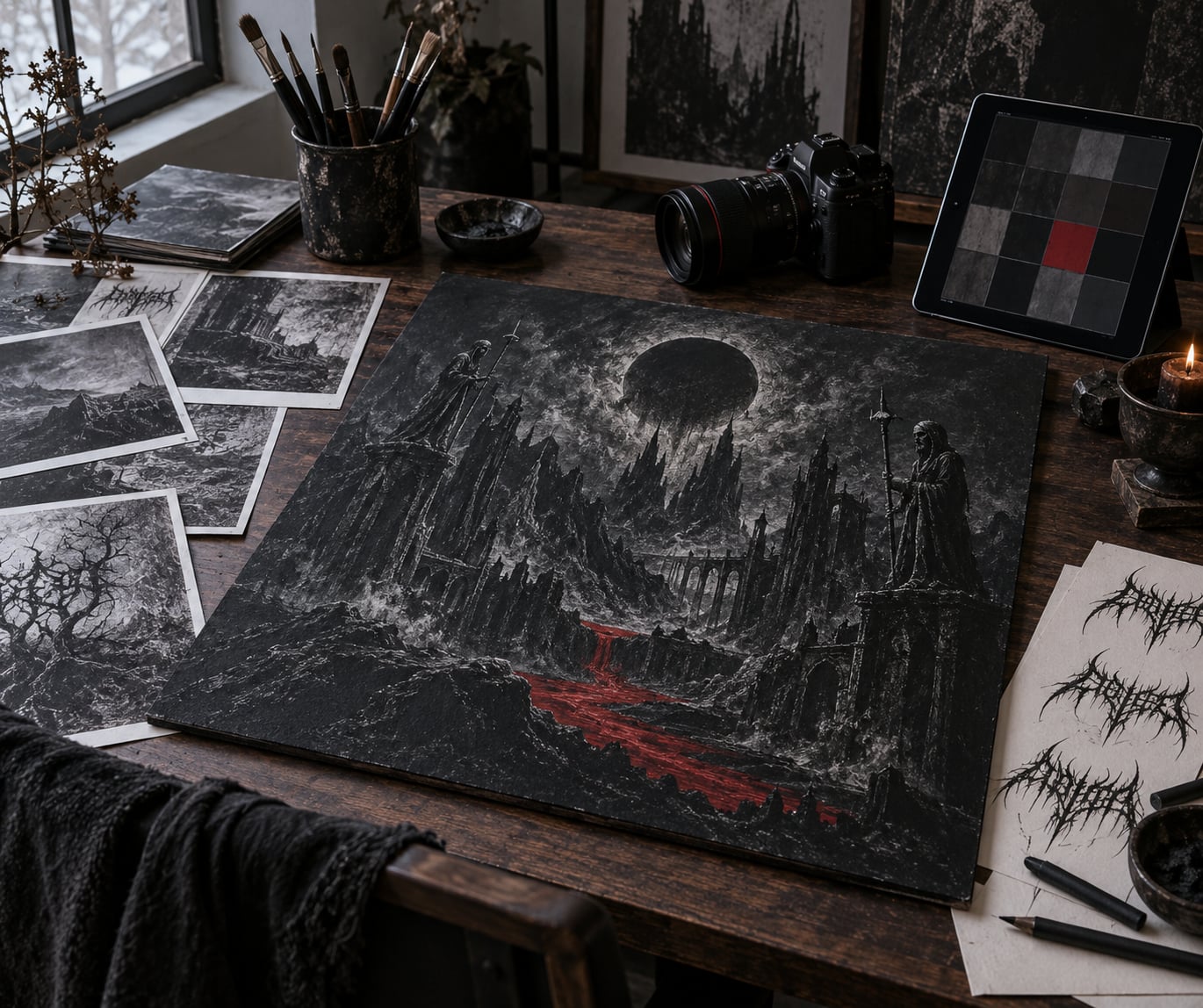
- Black metal: raw photocopy textures, high-contrast black and white, fog, forests and ritual scenes. Lo-fi is a statement about purity, not about budget.
- Thrash and crossover: speed lines, explosions, aggressive caricature, electric palette, band in action. Cartoon energy.
- Doom, stoner and sludge: slow monolithic shapes, mountains, desert horizons, smoke, huge scale, very few elements.
- Progressive and symphonic metal: surreal illustration, impossible architecture, cosmic scale, elaborate line work. Complexity is the point.
- Industrial: clinical photography, concrete, machinery, medical or laboratory framing, cold desaturated color.
- Metalcore and modern metal: band photography, motion blur, masked figures, shallow depth of field, muted color grades.
Matching the convention is smart. Beating it requires a deliberate idea strong enough to beat a skull.
Symbols, Characters, and Visual Shock
Skulls, demons, warriors, ruins, flames, inverted crosses, biomechanical machines and cosmic scenes recur because each one carries a meaning the audience already holds: death, power, collapse, purification, violence, the unknowable.
Character imagery is different. A single invented figure, armored or faceless, standing in for the band, is the oldest metal cover idea there is. It scales to merch better than almost anything else, and it gives the band a mascot for stickers, patches and tour banners.
Shock has a shelf life. A cover designed purely to offend gets talked about for a week and then ignored, and the modern listener is harder to shock than the 1985 listener. The covers that age well use ugliness in service of an idea rather than as the idea itself.
Two cautions matter here. Religious imagery has produced real bans, pulled orders and protest campaigns, and no commercial gain has ever justified that fight. And motifs lifted from living illustrators, from fantasy films or from classic paintings have ended releases in court, so provenance is not optional.
Color, Typography, and Composition
Palette is the fastest signal a cover sends. Desaturated black, bone and blood red is the genre default because it reads instantly at small size, survives cheap printing, and looks correct next to a wall of other metal releases.
Metallics are used sparingly and deliberately. Gold trim suggests ritual and antiquity, silver suggests cold technology, bronze suggests decay. Applied over a photographic or rendered base, gold leaf works as a physical layer and needs a scan back into the file, which is why it shows up on vinyl runs and rarely on digital-only releases.
Typography splits into two opposed camps. Legible display lettering uses a heavy gothic or sans-serif face, sits flat, and tells you the band name immediately. Illegible lettering fuses spikes, mirrors and overlapping strokes into something almost unreadable, which works as a mark of extremity and fails entirely as information.
The compromise most working designers reach for keeps the logo unreadable and the album title clear, so the band stays mysterious and the record stays findable. Arched, warped or perspective-distorted lettering appears constantly to fill dead space above a central image.
Composition-wise, one rule does most of the work: pick the focal point, then check it at actual thumbnail size before any more detail goes in. Most metal covers are designed for a 12-inch sleeve and then judged on a phone, and that mismatch explains more failed covers than bad painting does.
How Metal Album Covers Are Designed
Directly: metal album covers are designed through a commissioned chain that runs band or manager, sometimes label A&R, then illustrator, then prepress and printer. The designer builds concepts from the music and a written brief, iterates on sketches, produces the art at high resolution, adds the logo, grades and textures the whole thing, and delivers separate files for streaming and for each physical format.
That chain matters because the people holding each end rarely want the same thing. A band wants extremity and personal expression. A label A&R wants a release that looks expensive and identifiable in a playlist. A record plant needs specific bleed, resolution and color handling or the run is rejected.
A good creative brief closes that gap. It names the subgenre and its visual references, the two or three songs that define the mood, themes to include, themes to avoid, the sign-off person, the deadline, and every format the art has to serve, including merch and tour posters. Bands that skip the brief usually pay for it in revision rounds.
Ownership is decided in writing before the first sketch. The usual arrangement transfers copyright to the band on payment while crediting the illustrator by name, and keeps the artist’s portfolio rights and a reuse clause. Bands also need to know whether they may put the image on shirts, splits and posters, because that is how a single cover earns money for a decade.
Photography, Illustration, and Digital Production
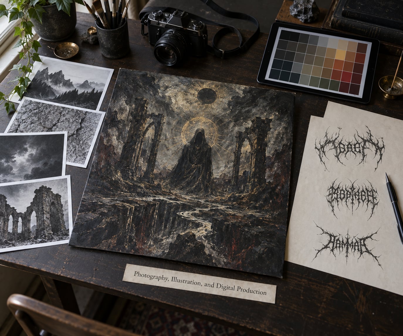
Photography is fast, specific and unforgiving. It suits modern metal, industrial and anything built around a real person or place, and it fails when the brief calls for something impossible to stage.
Traditional painting is the genre’s native mode. Airbrush realism, oil illustration and cross-hatched ink work each carry decades of metal credibility, and they cost the most in time. Photomontage splices found photography with painted or rendered elements, and it became the standard look of the 1990s because it looked expensive without being expensive to produce.
Digital painting and 3D rendering cover most new work now. ZBrush and Blender handle creature and architecture work, Octane and Cinema 4D handle lighting and material, and Photoshop, Procreate or Clip Studio Paint handle assembly, lettering and grading. Most current metal covers are a hybrid of a rendered or painted base with heavy 2D compositing on top.
One practical note for bands: ask for layered working files, not just the flattened final image. Merch printers, tour poster designers and reissue labels will need to pull elements out of that artwork for years.
Printing, Formats, and Shrinking to a Thumbnail
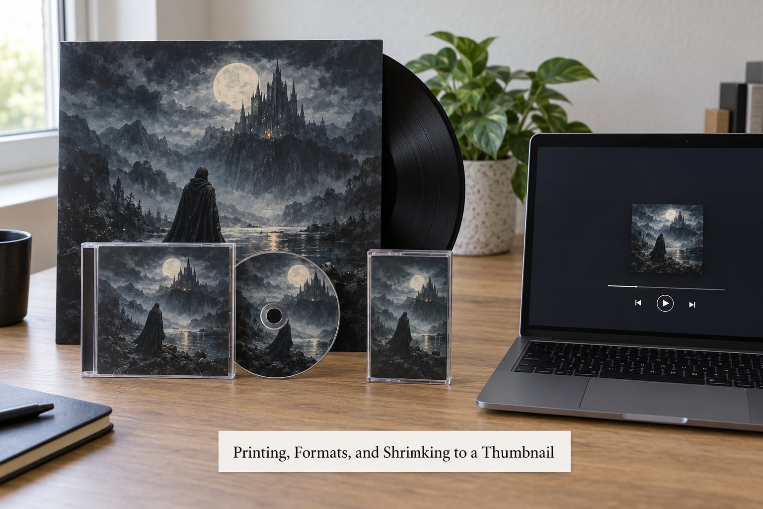
The standard digital master is a 1:1 square at 3000 by 3000 pixels, saved as JPG or PNG, which comfortably covers both streaming platforms and small print runs. Anything smaller than about 2000 pixels starts to soften as soon as a label or a fan scales it up.
Print files need more care. Vinyl and CD artwork is prepared at 300 DPI with bleed beyond the trim edge, artwork placed inside a safe margin so nothing important sits in the cut area, and colors converted to the CMYK profile the printer uses. Dark, saturated blues and near-blacks are where CMYK conversion shows up worst, so those get proofed on the actual press stock before a full run is committed.
Formats also change the composition. A vinyl sleeve is 12.375 inches square with an opening seam that eats a strip of the front, and gatefold jackets hide artwork across two panels that meet at a fold. CD booklets and digipaks are read at a size where fine texture disappears and hand-drawn line work turns to mud, which is another argument for a bold focal image.
For the streaming era, the honest test is to export the square master at 160 by 160 pixels and look at it on a phone. If the band name, the mood and the focal image all survive, the composition is finished. If it turns into grey noise, the fix is usually contrast and fewer elements, not more detail.
How Bands and Designers Avoid Cover-Art Mistakes
Generic subgenre imagery. A skull on a black field says nothing about this band. Fix: one detail that only this record could have, taken from the lyrics or from the band’s own history.
Unreadable lettering. Extreme logos destroy the album title and the streaming search match. Fix: keep the logo illegible if you like, but set the release title clearly somewhere else.
Weak hierarchy. Equal weight on every element reads as clutter. Fix: decide the single thing the eye should hit first and subordinate everything else.
Too much detail. Fine line work dies below sleeve scale. Fix: push values apart so shapes read as shapes, not as hatching.
Concepts that fight the music. Fans notice, and they are not polite about it. Fix: send the record to the artist, not just the tracklist and a reference link.
Low-resolution sources. Art pulled from an image search or upscaled from a web-sized file looks soft no matter how well it is graded. Fix: verify the resolution of any source material before it enters the layout.
Late revisions. Print files lock weeks before pressing, and streaming platforms cache artwork. Fix: set a decision deadline in the brief, not a wish.
Unclear rights. Public domain status, model releases on photography and AI-assisted work all need to be settled on paper. Fix: put the terms in writing before payment, and check whether a distributor requires artwork disclosure.
On AI specifically, the honest summary is that it is useful for a rough mood or a texture plate and unreliable as a finished, credited cover. Listeners notice the telltale artifacts, and metal audiences in particular treat a named human artist as a mark of respect. If AI is used for anything visible, disclosure and licensing terms should be checked against the distributor’s rules first.
Frequently Asked Questions
Who actually designs metal album covers?
Usually a commissioned illustrator or a designer with a metal portfolio, sometimes the band’s own member. Self-designed covers are common in black metal and black metal-adjacent scenes, where the rough photocopy look is part of the statement. A label A and R or manager sometimes commissions on the band’s behalf, but the band should still sign off on the direction and own the final files.
How long does it take to design a metal album cover?
A professional commission usually runs from four to ten weeks depending on style. Photography and typographic concepts move fastest, while a painted or airbrushed piece can take months because of rendering and revision rounds. Rush work is possible for a digital-only release but risky for vinyl, where the printer needs print-ready files well ahead of pressing. Book the artist before you announce the release, not after.
Can a band use AI-generated artwork for a metal album cover?
Technically yes, but the results are uneven. AI handles mood boards and texture plates well and struggles with a coherent central image and with lettering. Metal listeners detect the artifacts quickly, and some labels and distributors ask for disclosure. If you use it, keep the finished composition human-directed, check your distributor’s policy, and be honest in the credits.
What should a band give the designer before work starts?
A written brief with the subgenre and its visual references, two or three songs that set the mood, lyrical themes to include and to avoid, the sign-off person’s name, a deadline, and every format the art must serve including merch and posters. Include the licensing terms in that document. The finished record or a rough mix matters more than a long written explanation of your vision.
Does a metal album cover have to be original?
The artist must own the rights, and borrowed material creates real exposure. Public-domain paintings can be used legally, but they are already visible to anyone. Copying a living illustrator’s style closely enough to be recognisable can support a copyright or trademark claim, and unretouched found photography can breach the photographer’s copyright even when the subject agreed to be photographed. Commission original work and keep the contract.
Why are death metal logos so hard to read?
Illegibility is the point. Spikes, mirrored strokes and merged letterforms signal extremity and refuse to look like pop, so an unfamiliar wordmark reads as an aggressive shape rather than a name. It works as a mark on a shirt or a sticker. It fails as information, which is why most serious releases pair that logo with a clearly set album title.
Where to Start with a Metal Album Cover
Start with the record, not with a style. Listen to the album and write down three words for how it feels, collect ten references that already do what you want, and pick one concept strong enough to survive being shrunk to a thumbnail. Everything after that, from the brief to the print file, is execution.